Technical Communication Portfolio
In my Spring semester of Junior year, I took ENGL410 with Dr. Sean Zdenek. While the official name for this class was Technical Writing, Dr. Zdenek preferred to call it Technical Communication. His reason being that in the Internet era, people communicate using a multitude of modalities - not just writing. In his class, we talked about a host of topics. We talked about typical technical writing concepts such as sentence structure and using powerful verbs, but Dr. Zdenek introduced us to many different (and exciting!) concepts that you wouldn’t talk about in a typical technical writing course.
We talked about designing eye-catching documents, typography, effective YouTube tutorials, and making our writing accessible. This was as much of a design course as it was writing course. Yes, this class helped me become a better document writer, but I think this class helped me the most in becoming a better document designer. The strongest takeaways I had from this class were how to effectively chunk and highlight sections of my documents in order to maximize readability and scanability. Before I took this class, many of my documents consisted of unsegmented paragraphs with little to no headings. Now, I make sure to “trim the fat” and organize everything into neat hierarchical structures that can be understood at a glance.
We had 4 major assignments across the semester, and a dozen or so small “portfolio prompts” due at the end of the semester. On this page, you can find the 4 major assignments and 7 portfolio prompts.
The portfolio prompts are split into two sections: design and writing.
The design prompts are focused on anything that isn’t your traditional print document. This includes items such as flyers and posters. Design prompts were the most interesting to work on, and gave me a newfound respect for graphic designers and their work.
The writing prompts are your more standard technical writing assignments. These include topics such as instructions and explaining a technical topic to a non-expert audience. While these were “less fun” than the design prompts, they were still very useful in honing my writing skills.
If I had to choose a single assignment out all of these with respect to how useful it is for my future work, I would have to choose the Proposal document. I want to go to graduate school for Computer Science Education, so this assignment gave me the chance to see what writing a real proposal would be like. I spent a lot of time researching and coming up with a viable solution, and I would work on this proposal topic more if I had more time.
Anyway, enough with the reflection, let’s get on to the portfolio!
Major Assignments
Explain Like I’m…
In this assignment, we were asked to explain a technical topic to three different audience levels. I chose to talk about one of the most fundamental algorithms in Machine Learning, the perceptron.
First Audience: 5th Graders
I was especially interested in the challenge of trying to explain this topic to the fifth grade audience. I decided to explain my topic in the form of a classroom poster, similar to the ones I enjoyed reading on classroom walls when I was that age.
Second Audience: Freshman STEM Major
The audience for my professional document was high-school and college aged individuals who are more comfortable with math notation. Now with the math barrier gone, I can give a more ‘truthful’ explanation of how exactly the perceptron works using multiplication and addition.
Third Audience: Using only the Top “Ten-Hundred” Words in English
The 1000 words constraint was the most fun to design. I took cues from Randall Munroe’s Thing Explainer and made use of the blueprint aesthetic. I have to admit that this document is probably the least informative out of the three and takes a more general and humorous approach (much like Munroe’s explanations). The sheer limit of the constraint makes it very difficult to talk about basic mathematical operations
User Instructions
Making Your First Bass Sound on the Korg MS-20 Mini
For this assignment, we were asked to create a set of web-based instructions. I created a set of instructions to make a bass sound on a Korg MS-20 Mini Synthesizer. Synthesizers are electronic musical instruments that have the capability of producing many different types of sounds, but there can be a learning curve for absolute beginners. There are many settings, knobs, and wires that are involved, and it can quickly become overwhelming. Hopefully this helps some aspiring music nerd out there somewhere.
Screencast
Creating a Bootable USB Drive using Rufus
In this assignment, we were asked to create a short screencast tutorial for a technical topic of our choice. I chose creating a bootable USB drive using the Rufus tool.
Project Proposal
Professional Development Workshops to Increase Data Science Education in Delaware High Schools
This is one of the assignments I’m most proud of. Computer Science Education is something that I want pivot towards, and this project gave me a chance to practice my proposal writing skills (which I’ll probably need a lot of in graduate school).
This proposal was written for an imaginary organization called “The Delaware Foundation”. This organization looked for proposals from “residents of Newark and surrounding communities who are committed to improving the quality of life in our area.” The Delaware Foundation was willing to fund “any amount up to $10,000”
If given more time, this would totally be an idea that I would flesh out further.
Portfolio Assignments
Design Work
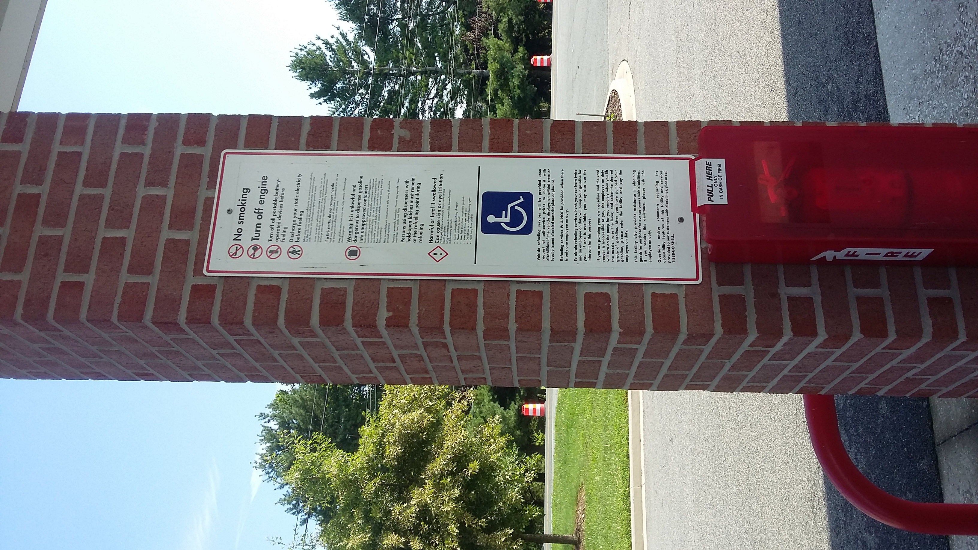
Accessibility at the Gas Pump
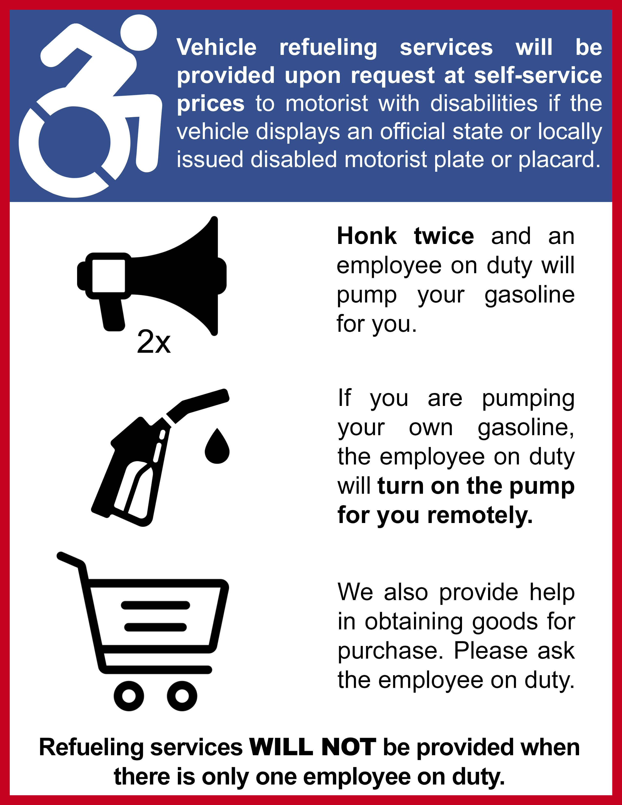
When filling up his car at the gas station, the professor noticed this sign and its poor design. It was to notify disabled drivers that they can receive help at the gas pump, but the font is simply too small to be read from inside a car. The goal of this portfolio prompt was to redesign this sign so that people can read and understand it quickly from a distance. I achieved this by using large icons, removing extraneous text, and bolding important phrases.
The heading icon is from the Accessible Icon Project The other icons are Creative Commons 3.0 and are designed by Freepik
Major Flyer
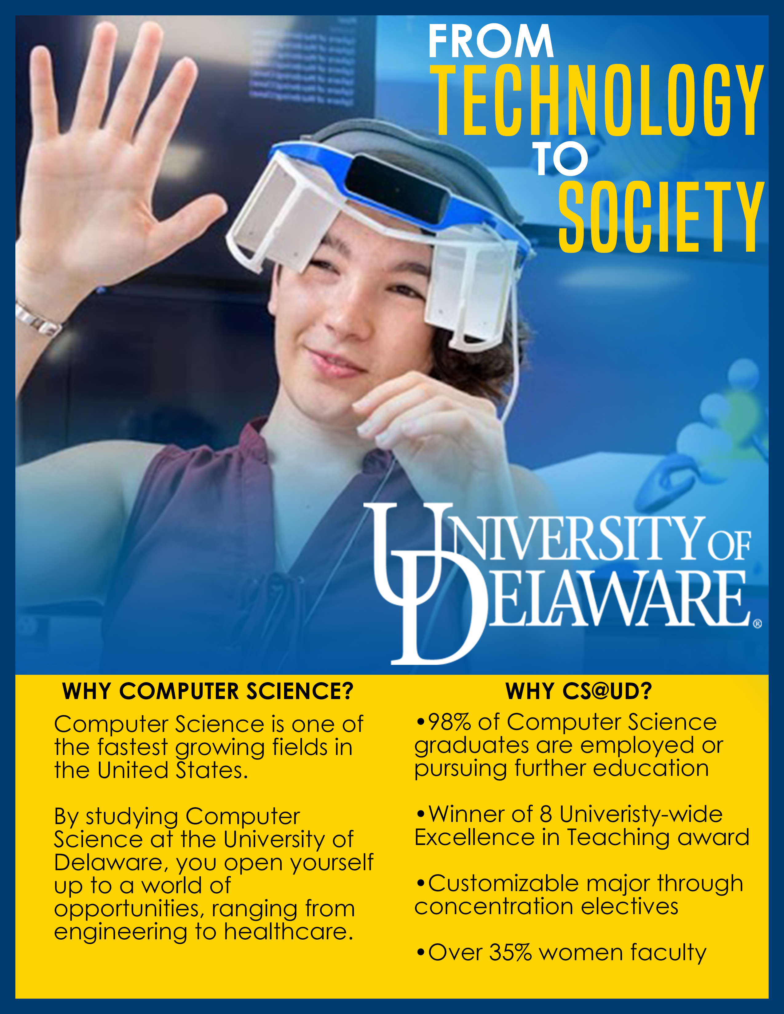
This assignment was to design a flyer for my major. The goal of this flyer was to be engaging and follow the principles of good design. One of the main constraints was that we had to follow the University of Delaware’s Brand Platform Style Guide, which consisted of a list of constraints for colors, fonts, and language. Since some of the fonts in the style guide cost money, so I emulated them the best I could with fonts I could find online. The picture is of my friend Alina Christenbury in her custom built Augmented Reality headset, and is used with permission. (Check out her website!)
Technical Writing for Steve Harvey
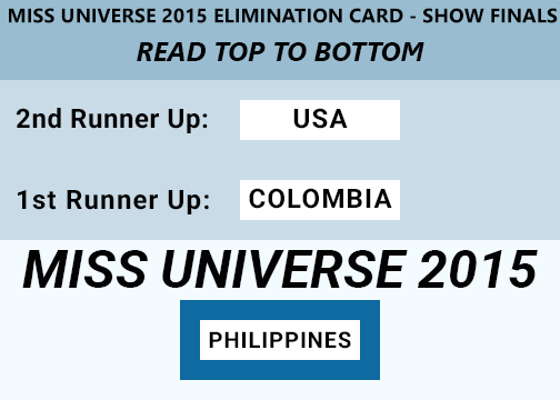
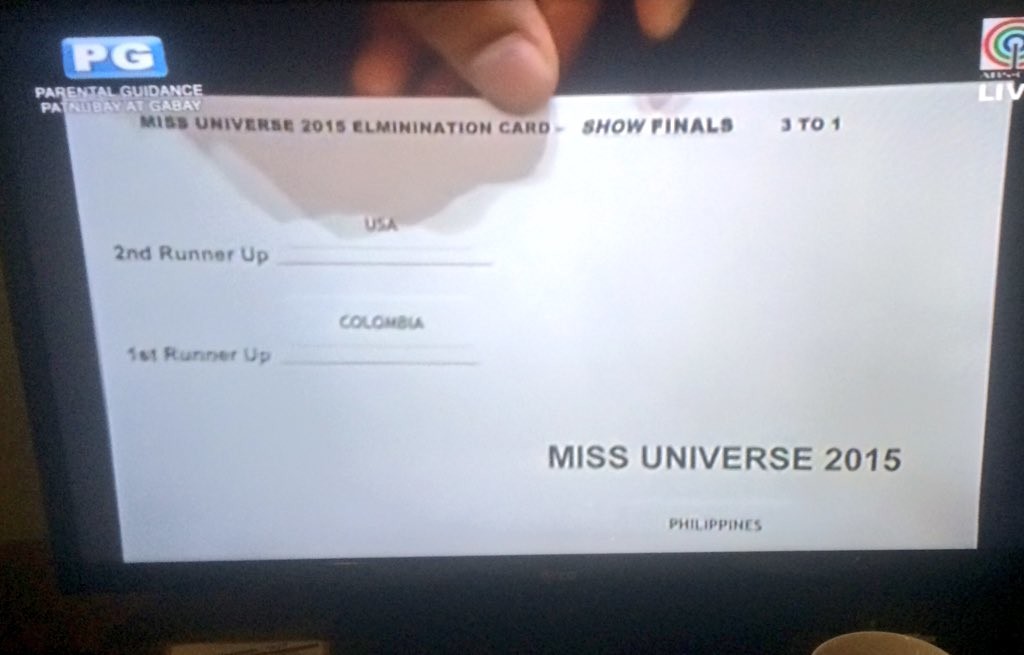
Remember the 2015 Miss Universe fiasco? If you don’t, Steve Harvey accidentally announced the wrong winner in the final moments of the competition. Harvey was ridiculed for a while after, but if you take a look at the announcement card he was given, you can’t really blame him. The card has no discernable structure or order to the way the names are shown, and the actual Miss Universe is hiding in the bottom right corner. The goal for this prompt was to “use the principles of good design in the readings to craft a winner’s card that can be read quickly and effectively in the high-pressure environment at the end of the Miss Universe broadcast.”
Tech Tip
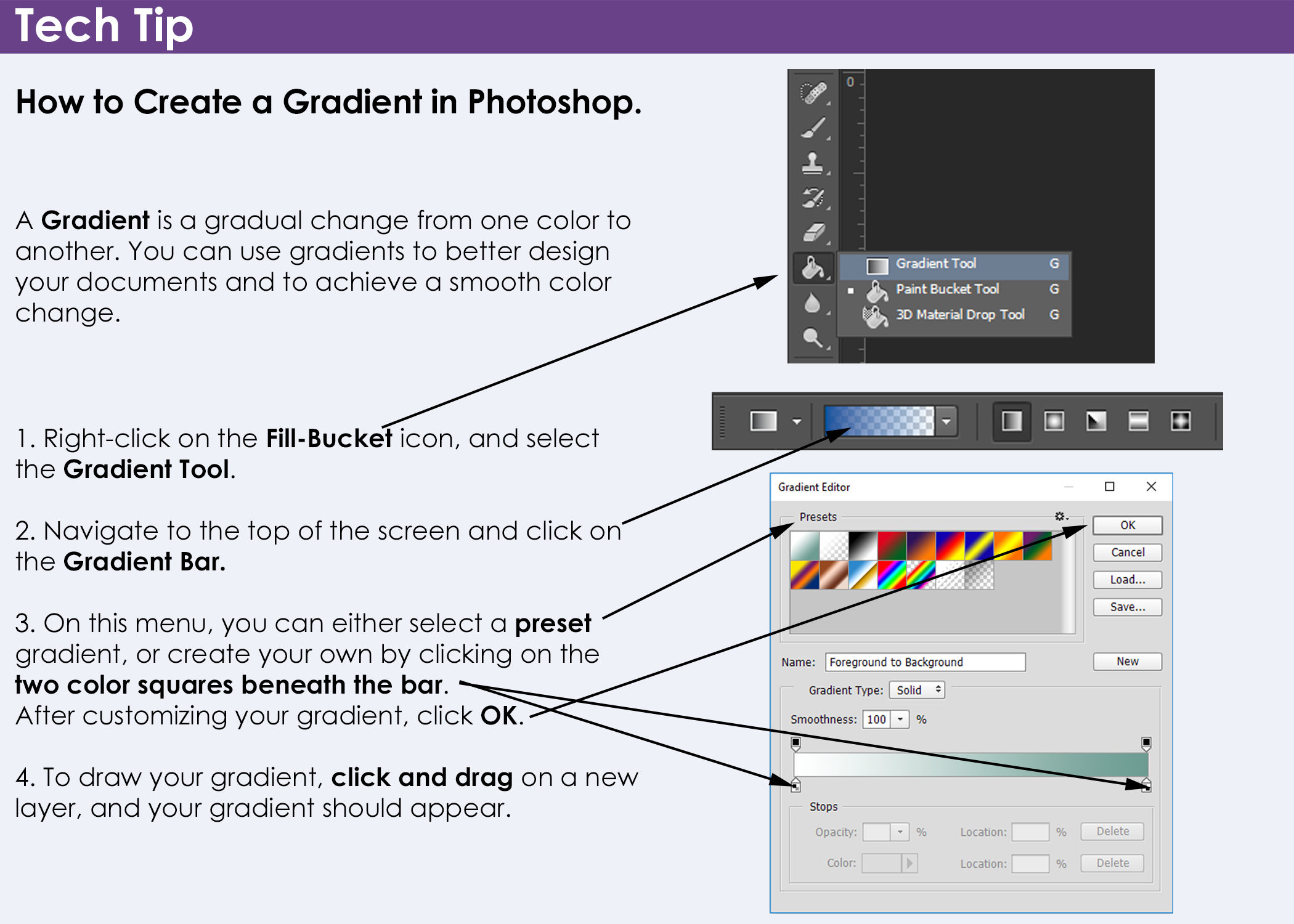
The goal of this prompt was to create a Tech Tip that was “Visually inspired by and resemble the following examples of tech tips from a popular technical communication textbook”. This Tech Tip was to be of something that is useful to others in a Technical Communications class, so I decided on a design themed tip.
Writing Work
Writing for a Non-Expert Audience
Download the PDF here.
In this assignment, we were asked to “translate” a piece of technical information from our major to be understood by a non-expert audience. For this topic, I picked a hot topic in machine learning - Generative Adversarial Networks. We were asked to cite some Federal Plain Language guidelines that were used.
Two of the main guidelines that I aimed to follow was to keep it conversational and write for your audience. I used an extended analogy in order to try and make the concept as easy to understand as possible. I also tried to use good design principles, such as using a right ragged edge and using serif fonts.
Radically Revised Instructions
Our professor ordered a new laptop battery off of Amazon, and it came with these instructions. These were obviously written by someone with a poor grasp of the English language, so it was our job to radically revise the instructions.
USDA Revision
Download the PDF here.
In this assignment, we were asked to revise a letter from the USDA in our textbook and remove weak verbs. I have to admit that this was the hardest portfolio prompt out of them all, since it used a lot of domain specific jargon. It was hard to parse the original document, so hopefully my interpretation makes more sense. (I don’t have a high quality image of the textbook letter handy, and I don’t know if I would be allowed to reprint it here.)